|
|
|
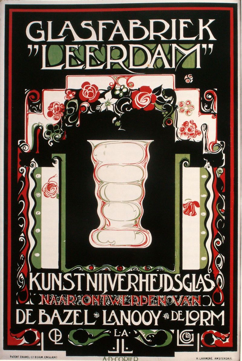
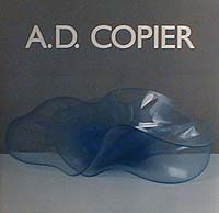
Andries Dirk Copier is a unique figure in Dutch glass history, devoting most of his life to the Leerdam factory, becoming it's best known designer through a boom period, and maintaining a unique position for 70 years. Among the architects and graphic designers recruited to Leerdam's designer list, only Copier was the first to be trained and groomed by the glass industry, rising from lowly apprentice to the best-selling designer in his field with an international reputation for honesty and simplicity in design. The protégé Son of a glass-blower at the Leerdam factory, Dries started work there at the age of 13, and at the age of 17 was selected by Managing Director Cochius for a course in typography in Utrecht, returning to Leerdam to work on exhibitions, publications and shop displays. Following a second period of study at the Rotterdam Arts Academy (under Jacques Jongert) followed by private tuition sponsored by the factory, he mounted his first exhibition of hand-made work at the Boyman's Museum in 1923, and he was given control over the design of the Leerdam's advertising and publishing activities. The poster-design which was printed on sheet-metal signs (see right) was widely praised, and shows all the key elements, the graphics derived from Jongert's style and the text focussing on designer names are combined in a startling and memorable image of the period. |
 |
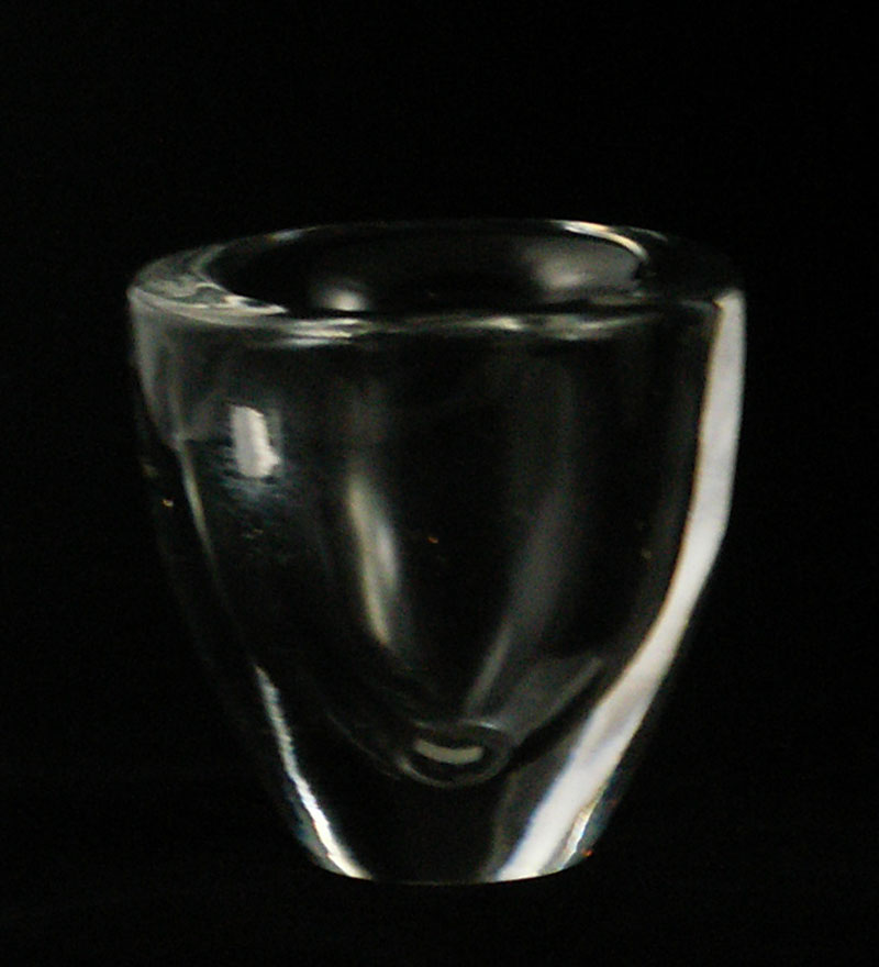
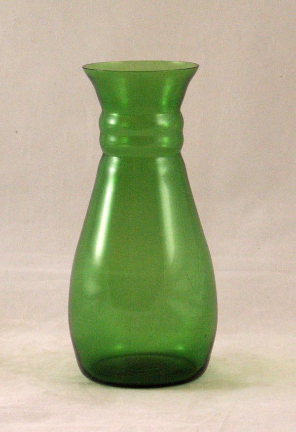
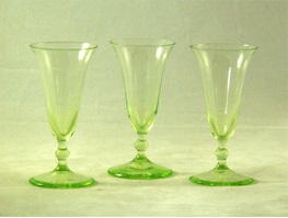
| The Rising Star Building on his experiences of managing the production of designs by de Bazel, the first Copier design to go into production was Smeerwortel (Comfrey) in 1923 quickly followed by a collection of popular successes; Winterbeker, Viola vase and his first water set, a narrow necked jug and glasses with a 'three-finger base'. The positive response from the market encouraged more designs with Romanda and New Model (N.M.) following in 1924. By the time Karel Wasch (factory director at Leerdam) published his first book on 'Glas en Kristal' in 1925, he, like Cochius was happy to praise the up-and-coming young designer and confident of his future. Copier had also worked extensively in the glass studio to create one-off ('Unica') pieces and the most popular of these were also issued as 'Serica'; limited editions of varying quantities. As well as allowing the master to experiment with a wide range of techniques, their sale as 'art-objects' continued to enhance the name of both designer and factory. |
|
|
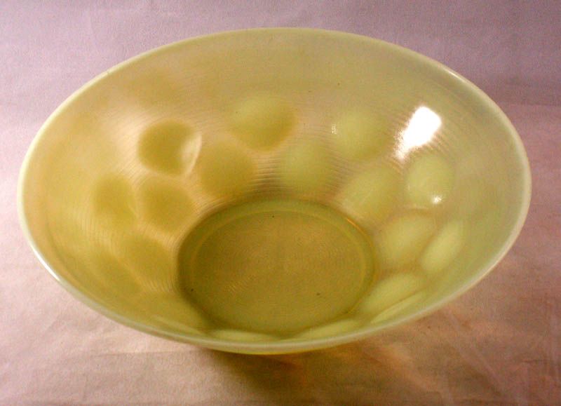
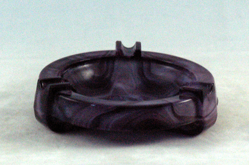
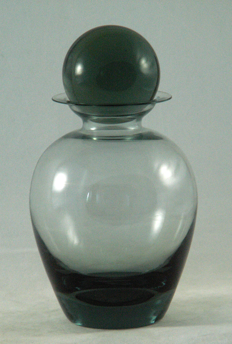
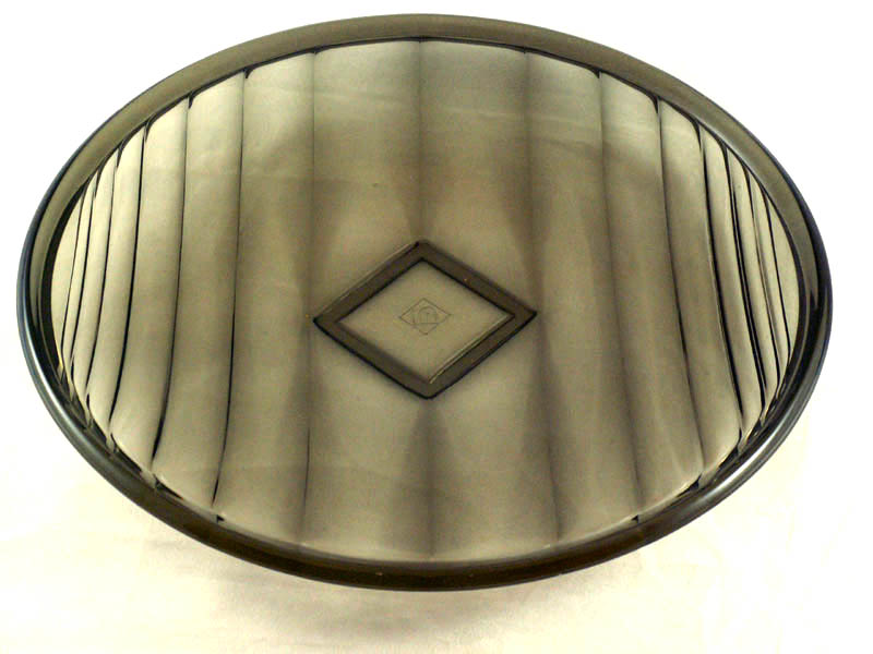
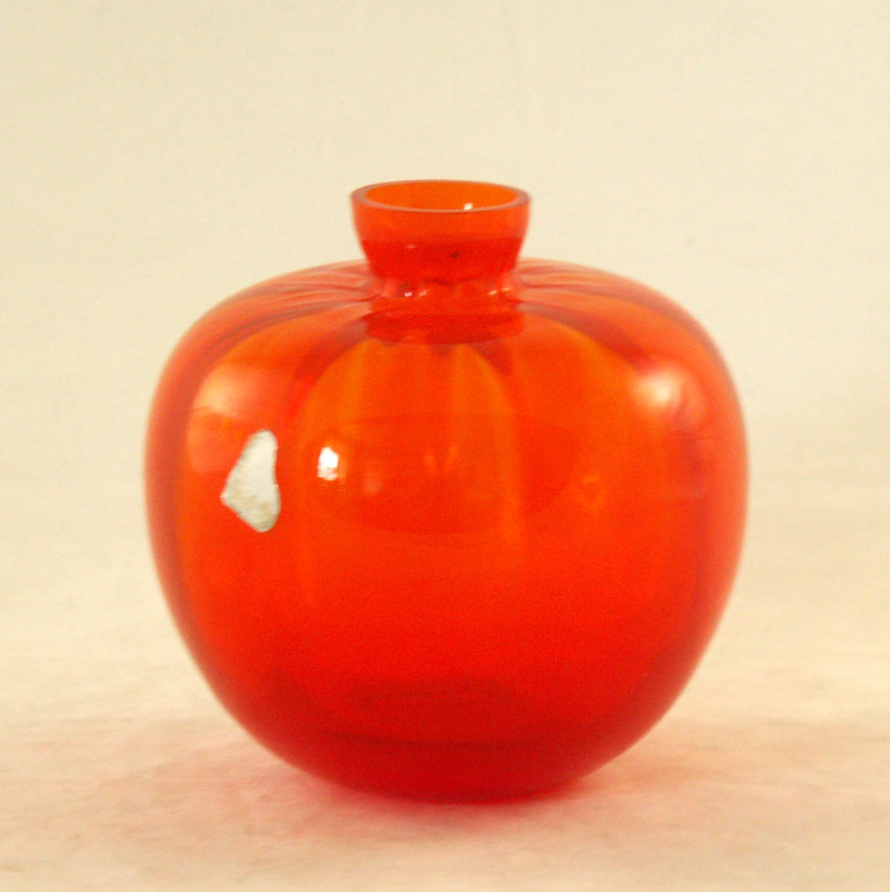
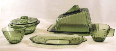
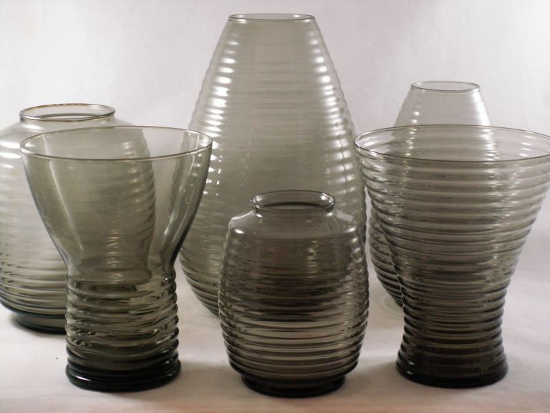
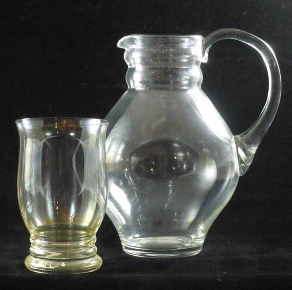
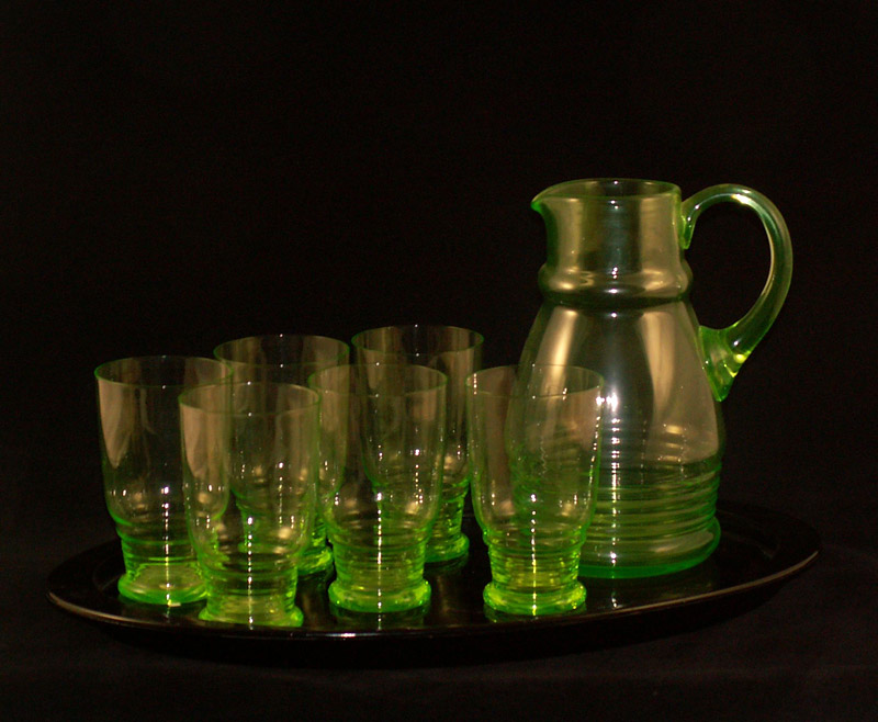
Orange and Sea-blue ('Meerblauw') In 1927 Copier began some colour experiments producing occasional production of red and 'goud-geel'(golden-blue) before selecting the colours orange and sea-blue ('meerblauw') for production experiments. Orange proved to have some unique problems, and it was difficult to cool-off the items without the colour going cloudy or dark. The 'meerblauw' colour, light blue and similar to Kristalunie's colour 'clair de lune' ('moonlight') was also short-lived and both colours were taken out of general production by 1930. Watersets & Services 1930/32 The 1930 catalogues were produced in loose-leaf format and are made all the more confusing because of the unclear and inconsistent use of names (Hendrik, Frida, Irene, etc.) for the various designs. Each basic shape was available as a waterjug and decanter in a standard range of colours. A full range of stemware and tumblers was offered (although some combinations were restricted to orders which were large enough to justify a special production run). Combinations such as a decanter with liquer glasses or a waterjug with tumblers were assembled by the retailers. Amethyst. 1932 The 1932 'GL' catalogue shows new shapes and a major innovation, adding a new colour 'amethyst', the first of the the generally lighter tints which would come to predominate in the years which followed. Most of the new services presented (Oedaya, Daventry, Lila, Olympus, Gelria, ) are trying to capture the most successful elements of previous models and give them a modernising twist. They have been designed to bring greater design quality into Leerdam's mid-market range and lead the shift to three-channel marketing (Sonoor, Household, Crystal) in 1935. Previous successes like Frida and Eleonora are offered in a limited range of colours. The Innovator In an effort to divesify the range of products, Copier was also an industrial innovator responsible for new materials and improvemnts in design-technique. Graniver Graniver (made of half-melted grains of glass) was initially produced in 1929 and was mainly used for cactus pots and plant-holders. In practical use the material was not really resilient enough for horticultural use and was easily damage by discolouration, chips and (hairline) cracks. Tiles of graniver were produced for use in mozaiek arts and several notable examples of this use can be seen in contemporary photographs. Colopal (a coloured opalescent opaque glass recipie), was more opaque than the colour used for Berlage's flatware of 1924, and the shade was more muted. Copier initally used for the primrose-blue pressed-glass breakfast service of 1931, but later there were items produced in blue, mint-green, pink and 'cappuchino'. It was also used to make nested bowls (Aurora and Gutta) and fruitbowls like Fantasie. Marmorite with distinctive black and blue marbeling on a purple ground) was a development of the colopal recipie, and famously associated with gift items from the chic patisserie 'Lindeboom'. It mat have been inspired by similar colours used by and Sowerby and Davidson(UK) at the end of the previous century. Rondo, 1934 The simple style of Rondo was new, and led a stylistic shift in Leerdam's crystal products. Distinctinguished by the completely round ball which acted as its stopper, the subtle colour was modern and chic, and the heavy base made it solid and practical. In these streamlined designs there were no decors used, no more etching or cutting, no bright or heavy colours and no optic ribs. Heavy Glass, 1935 Rondo inspired a range of simple forms for vases, vessels and bowls which were very successful. As a group the style became known as 'dikwandig' (thick-walled) and brought Copier's work to the notice of a newly emerging upper middle class. Although some moulds were used by the glass-blowers many of the designs contained other elements of handwork, and the designer's monogram was often placed prominently on the item. Copier - Ribbed Service, 1934 Changes to techniques as well as improved design led to innovations in pressed glass flatware and tableware some of which sold in very large numbers. Following the success of Gutta, various other sets were developed for each level of market. The grey ribbed flatware with Copier's monogram pressed into the centre panel, A multifunctional set of 3 -5 nested pressed-glass bowls soon became a standard part of every Dutch household. Orange Vase, 1938 Remembering the first 'Oranjevaas' made by Chris Lannoy in 1927, Copier produced the Beatrix vase in 1938 and it was offered as part of the Sonoor collection. |
|
|
Industrial Artist
The term 'Kunstnijverheid', meant promoting named designers and design quality of industrial products. It was a critical and commercial success, emulated by the competitors at Kristalunie Maastricht as well as by manufacturers of ceramics, furnishing and fabrics. Although Cochius was increasingly criticised for his management style, Copier continued through the 1930s, filling the catalogues with popular designs, and launching three collections to cater to low-, middle- and high incomes incomes. Adding to the established catalogues of Crystal and Sonoor products, the Household collection (H-collectie) was aimed at the mass market and featured robust pressed glass for the kitchen.
Workers in the glass industry had often been associated with poor living conditions and poor education, and alongside the promotion of 'industrial design' Cochius, motivated by his strongly religious background, was keen to improve housing and encouraged the establishment of the Leerdam Glass school. The Works Committee was created to provide a way for the workers to contribute to management decisions and the factory's reputation as a responsible employer with modern ideas gave added kudos to the reputation of their chief designer. Copier became it's principal and promoted it's values as part of the company's corporate profile. Products and catalogues were aimed at three seperate markets. 'Budget' products appeared for use in the working household (Houselhold=H-collection) and included popular ranges like the Neerlandia ((1939) tableware. The mid-market was offered the Sonoor collection with both crystal and better quality pressed-glass items including the Primula (1947) range of tableware. For the luxury market the company offered a crystal collection which included wafer thin crystal plateware as well as a selection of top range and serica products. Few new designs were released during the war years (1941-45) but the Leerdam factory emerged from it undamaged, and took advantage of the Marshall Plan to invest in new machinary (from Libbey-Owens of Illinois) and establish new export markets in the USA. The consequent rise in tooling-up costs and falling unit-costs quickly led to fewer designs and increasing production quantities. It was the beginning of the end for glassblowing in industry, and over the next 50 years the glassdesigners had fewer chances to produce new industrial designs and with increasing focus on craftsmanship, turned back to to the glass-blowing studios. Although Copier was the only full-time named designer, it is also clear that an important role was played by Thomassen, Heesen, Valkema and Boon. Their work in adapting designs for production and improving the quality of pressed and machine-made products was significant to the market success. Their names were never lauded by the company and only the chief designer, Copier, was ever given credit in their publications. |
 Copier - Neerlandia, 1939
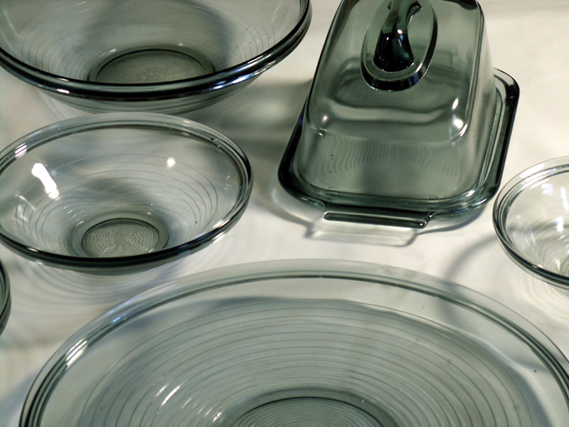 Copier - Primula, 1947
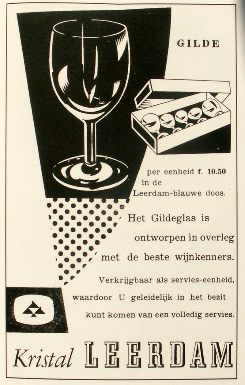 Copier - Gilde Glass, 1930 Copier - Gilde Glass, 1930 |
 |
Not only the best-known glass-designer in The Netherlands, Copier developed an international reputation too, but after the war he focussed increasingly on producing 'art glass' for the upper end of the market. Having worked hard to establish and maintain the Glass School at Leerdam (which was closed during goverment education reforms in 1950), it was his pupil Floris Meydam who became responsible for a new generation of machine-made designs for the mass market. 1950's After 1949, with Meydam producing many designs for the factory, (and an increasingly tense relationship between the former master and his pupil) Copier was increasingly free to mount his own exhibitions and travel. His last major designs for the factory included the popular ribbed vases (1953) and much-awarded Gourmet stemware (1958). |
|
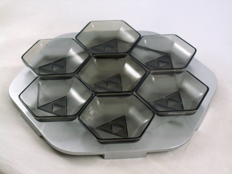
1960's Copier produced many unica pieces through the sixties, his exhibitions included general and retrospective shows, and several major editions of Serica, ceramics fo Eschenbach, plastic flatware for KLM, Advances in technology meant that smaller glass ovens were possible and therefore glassmakers were no longer dependent on the Leerdam site to produce their work. The kristal workshops became increasingly independent from the industrial factory next door, and were eventually sold as an independent business making expensive kristal art for special occassions and collectors. In 1964 he produced more than 250 unica pieces at Leerdam, but thereafter increasingly turned to the smaller studios run by individual glass-blowers. 1958 Award at Milan Triennial for 'Gourmet' service, 1958 Grand Prix award for the Dutch pavilion at the Brussels World Expo 1962 the A.D. Collection 1963 'Unica en Serica' exhibition City Museum, Arnhem 1963 A.D.Copier - 'Glas' Exhibition at Museum Boymans van Beuningen, 1963 Gold prize - Utrecht Trade Fair 1964 'Noordzee' exhibition in the garden of Copier's house in Den Dolder 1965 'Spel van Glas en Licht' in the garden at Bergeijk 1967 Copier Retrospective at City Museum, Den Haag |  |
 More Books About Copier...
 |
After leaving Leerdam in 1971, and especially after the death of his wife in 1976, Copier travelled in Europe and America, meeting with other glass artists and designing only Unica (one-off) works. As well as several musuem exhibitions, he visited colleagues at factories in Italy, Germany, USA, Czechoslovakia and Scandanavia, and inspired major exhibitions with master craftsmen Lino Tagliapetri, and Peter Novotny. He worked at various small glass ovens including de Oude Hoorn in Acquoy alongside Funnekers, Willem and Bernard Heesen, leading to a series of exhibitions.
In 1987 Copier was awarded the important David Roell Prize for the Guild glass and his other contributions to industrial design' In accepting the prize he revealed a more moderate attitude to alcohol, saying: "Glasses are like typefaces. A well-designed font is certainly a thing of beauty, but when you're reading a book you don't want it to distract you from the text. It's the same thing with a wineglass, the important thing is the wine!" |
|
|
|
Copyright (C) Hogelandshoeve & McLellan-Verhoeven, 2019. All rights reserved and images copyright unless otherwise stated. |
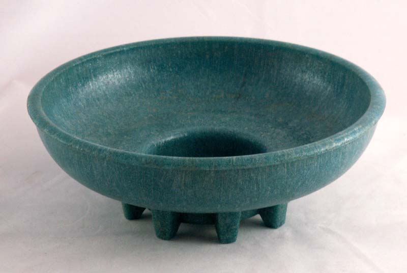 Graniver, 1929